Date
Thu Dec 25Living in the Pacific Northwest gives our homes a unique backdrop—and some tricky lighting to go with it. The soft, often-overcast skies here can play tricks on paint colors. A shade that looked perfect online can suddenly feel dull or washed out in person. This is why finding the best exterior color combinations for houses in our climate requires a special touch. You need smart siding color combinations that look just as beautiful on a gray Redmond morning as they do in the bright afternoon sun. We’ll show you how to work with our local light to choose a palette that feels vibrant and perfectly suited to your home.
Key Takeaways
- Coordinate with Your Home’s Unchanging Elements: The most successful color schemes don’t fight your home’s fixed features. Take cues from your roof color, brick or stone accents, and window frames to build a palette that feels cohesive and professionally designed.
- Choose Classic Palettes for Enduring Curb Appeal: Trendy colors can quickly look dated, which can affect your home’s value. Opt for timeless combinations that honor your home’s architectural style to create a look you’ll love for years, not just a season.
- Test Your Colors in Real-World Conditions: A paint chip looks different in the store than it does on your house. Use large sample boards and observe them on all sides of your home at various times of day to see how sunlight and shade affect the color before you make your final choice.
What Makes a Great Exterior Color Palette?
Choosing colors for your home’s exterior is about more than just picking a paint swatch you like. A great color palette creates a cohesive and inviting look that works with your home’s architecture, your roofing, and even your landscaping. Think of it as dressing your home for success. The right combination of colors for your siding, trim, and accents can make your property feel thoughtfully designed and significantly increase its curb appeal.
The color of your home is the first thing people notice, and it sets the tone for everything else. It has a huge impact on how your home feels, both to you and to your visitors. A well-chosen palette can highlight beautiful architectural details, while a less considered one can make a house feel dated or out of place. Whether you’re planning a full residential siding replacement or just a fresh coat of paint, putting thought into your color scheme is one of the most effective ways to transform your home’s entire look and feel.
How Color Affects Your Home’s Vibe
Your home’s exterior colors are its first impression. The right shades can make your home look timeless and modern, while the wrong ones can make it feel mismatched. It’s also important to remember how much natural light affects color. As the design pros at Better Homes & Gardens explain, the way a color looks can change dramatically between a bright, sunny day and a classic overcast Pacific Northwest afternoon. That’s why it’s always a good idea to look at paint samples outside at different times of the day before making a final decision.
Improve Curb Appeal and Value with the Right Colors
A smart color scheme is a powerful tool for boosting your home’s curb appeal. One simple but effective strategy is to use a contrasting trim color. A crisp white trim against a darker main color, for instance, helps the primary hue stand out and creates a sharp, polished look. Neutral colors like gray, beige, and cream are excellent choices for a strong base, as they provide a versatile foundation. You can then layer in splashes of brighter colors on your front door or shutters to add personality and create a balanced, welcoming appearance.
Our Favorite Exterior Color Combinations for Houses
Choosing the right color palette for your home’s exterior can feel like a huge decision, but it’s also one of the most exciting parts of a renovation. The right combination can completely transform your home’s personality and make it the standout on the block. Whether you’re drawn to timeless neutrals or a bold pop of color, there are some classic pairings that always deliver. Let’s explore a few ideas to get your creativity flowing.
Go Classic with a Black and White Palette
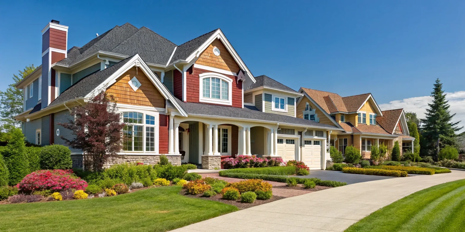
You can never go wrong with a classic black and white scheme. This high-contrast combination creates a clean, crisp look that feels both modern and timeless. Imagine your home with brilliant white James Hardie siding and sharp black trim around the windows and doors—it’s a look that instantly highlights your home’s best architectural features. This palette is the cornerstone of the modern farmhouse aesthetic but is versatile enough to work on almost any style of home, from a traditional colonial to a sleek contemporary build. It’s a choice that’s always in style and makes a powerful statement from the curb.
Embrace Nature with Grays and Earth Tones
If you’re looking for a palette that feels grounded and elegant, grays and earth tones are a perfect choice. These colors are inspired by nature, creating a warm and harmonious feel that blends beautifully with the Pacific Northwest landscape. A soft gray siding paired with creamy white trim offers a modern yet inviting balance. For a look that feels even more connected to the outdoors, consider pairing a muted green with a charcoal gray. These sophisticated combinations provide depth and character without feeling overwhelming, creating inviting curb appeal that is both subtle and stunning.
Make a Statement with Navy and Bold Accents
For those who want to make a bolder statement, a deep navy blue is a fantastic option. Navy acts as a new neutral—it’s classic and strong, providing a rich backdrop for other colors. Pair navy siding with crisp white trim to keep the look bright and defined. The real fun comes with the accent color. A vibrant yellow or a cool turquoise on the front door adds a welcoming pop of personality that catches the eye. This kind of thoughtful color scheme shows confidence and character, creating a memorable look that feels both polished and playful.
Get the Modern Farmhouse Look
The modern farmhouse style is all about creating a cozy, welcoming atmosphere, and the color palette is key. Instead of sharp contrasts, this look leans on soft, warm neutrals that feel layered and comfortable. Think of a gentle beige or off-white siding paired with classic white trim and subtle cream accents on gables or porch columns. The goal is to create a home that feels bright, airy, and inviting from the moment you see it. These universally appealing colors ensure your home has lasting charm that won’t feel dated in a few years.
How to Choose the Right Exterior Colors
Choosing an exterior color palette can feel like a huge decision, but it’s also one of the most exciting ways to put your personal stamp on your home. The right combination of colors can highlight your home’s best features and create a welcoming vibe from the moment someone pulls up to the curb. Instead of getting lost in a sea of paint chips, you can simplify the process by focusing on a few key principles. By considering your home’s architecture, its surroundings, and its existing features, you can confidently land on a color scheme you’ll love for years to come.
Start with Your Home’s Architectural Style
The best place to start your color journey is with your home’s architecture. Certain color palettes are naturally suited to specific styles, creating a look that feels both authentic and polished. As design experts at Real Simple note, “A home will really shine when you honor its architecture by choosing a paint shade inherent to that style.” For example, a classic Colonial home looks stunning in timeless whites and deep blues, while a Craftsman-style house pairs beautifully with earthy greens and warm browns. Your residential siding choice also plays a huge role here, as materials like cedar or James Hardie plank come with their own stylistic feel that can guide your palette.
Look Around: Consider Your Neighborhood and Climate
Your home is part of a larger picture—your street, your neighborhood, and the Pacific Northwest landscape. While you don’t need to copy your neighbors, it’s wise to choose colors that feel harmonious with the surrounding homes. The unique climate of the Puget Sound region also matters. Our often-overcast skies can wash out some colors or make others appear more vibrant. This is why it’s so important to “always look at colors in the location they will be used,” as advised by the experts at Ply Gem. A color that looks perfect online might feel completely different on a gray Redmond morning.
Account for Sunlight and Permanent Features
Light is one of the most significant factors in how we perceive color. A warm beige might look perfect in the bright morning sun but appear drab in the afternoon shade. As Better Homes & Gardens points out, “Natural light changes how paint colors look. It’s a good idea to look at paint samples outside on both sunny and cloudy days.” You also need to account for the fixed features of your home—the elements you aren’t changing. This includes things like a brick chimney, a stone pathway, or the color of your roofing materials. These unchangeable details should guide your palette, not fight against it.
What Color Siding Goes with Your Roof?
Unless you’re doing a complete exterior overhaul, you’ll need to work with your existing roof and siding colors. These large surfaces are the foundation of your color scheme. If you’re just painting your trim or installing new windows, their colors must complement what’s already there. As color consultant Maria Killam wisely puts it, “When choosing vinyl windows, don’t ignore the colour of your house.” Look for undertones in your roof shingles or siding. A gray roof might have hints of blue or green, which you can pull out for a sophisticated shutter or door color. This creates a cohesive, professionally designed look where every element works together.
Gather Inspiration from Pinterest and HGTV
When you’re trying to picture the perfect color palette for your home, sometimes you just need to see it in action. Platforms like Pinterest are a fantastic starting point, offering endless visual inspiration with thousands of photos showcasing different color combinations on real homes. This allows you to see how certain shades look in various lighting conditions—a key consideration here in the Pacific Northwest. Similarly, resources from HGTV and paint companies offer curated color collections tailored to specific architectural styles. As the experts at Better Homes & Gardens explain, it’s crucial to observe colors outside on both sunny and cloudy days. Browsing these resources helps you build a vision and find palettes that feel both personal and professionally designed, making the final decision much less intimidating.
Painting for Profit: How Colors Impact Resale Value
Choosing an exterior color palette is about more than just personal taste; it’s a strategic decision that can directly impact your home’s curb appeal and financial worth. The right combination of colors can make your property look updated, well-maintained, and inviting to potential buyers. On the other hand, a less-than-ideal choice can make a home feel dated or out of place, potentially turning buyers away before they even step through the front door. When you’re investing in your home’s exterior, whether it’s new residential siding or a fresh coat of paint, thinking about resale value from the start is always a smart move.
The Best Paint Colors for Higher Resale Value
If you’re planning to sell your home in the near future, selecting colors with broad appeal is key. Timeless neutrals are a consistently safe and effective bet. Shades like warm gray, classic beige, and creamy off-white create a clean and sophisticated canvas that allows potential buyers to easily envision themselves living there. These colors serve as a strong base, making it simple to add personality with pops of color on the front door, shutters, or trim. A neutral palette helps your home look fresh and well-cared-for, signaling to buyers that the property has been thoughtfully maintained.
Exterior Paint Mistakes That Can Lower Your Home’s Value
One of the most frequent missteps homeowners make is choosing a color that clashes with the fixed elements of their house. Your roof, brick or stone accents, and even your window frames have colors that aren’t easily changed. It’s crucial to select siding and trim colors that harmonize with these features, not fight against them. Another common mistake is getting swept up in a trend that will quickly look dated. While a bold, of-the-moment color might seem exciting, it can hurt your resale value down the line. It’s often best to avoid these common exterior color mistakes by sticking to classic palettes.
Winning Over Buyers from the Curb
Your home’s exterior is the very first thing a potential buyer sees, and it sets the stage for their entire viewing experience. A cohesive and attractive color scheme creates an immediate impression of quality and care. The right colors make your home feel both timeless and modern, while the wrong ones can make it look mismatched or neglected. To ensure you get it right, always test colors in the location where they will be used. Paint a large sample board and observe it at different times of day to see how it looks in changing light before you commit to the entire house.
The Best Color Palettes for Different Home Styles
Your home’s architectural style is its personality, and the right color palette is the perfect outfit. Choosing colors that honor your home’s design—whether it’s a classic Colonial or a sleek modern build—is the key to creating a cohesive and stunning exterior. Instead of fighting against the inherent character of your house, lean into it. The right combination of siding, trim, and accent colors will make your home look like it was always meant to be that way.
Think of it as a partnership between your home’s structure and your personal taste. A well-chosen palette can highlight beautiful architectural details, like intricate trim or a welcoming front porch, while an ill-fitting one can make those same features feel out of place. By understanding the core principles of different architectural styles, you can select a color scheme that feels both authentic and fresh. Let’s explore some go-to color schemes for popular home styles here in the Pacific Northwest to help you find the perfect match.
Expert Advice: Highlighting Your Home’s Architecture
Your home’s architectural style is its personality, and the right color palette is the perfect outfit. The most successful exterior designs don’t fight the home’s inherent character; they celebrate it. A home will really shine when you honor its architecture by choosing shades that feel authentic to that style. For instance, a Craftsman home naturally comes to life with earthy tones, while a modern design might call for a bold, high-contrast scheme. A well-chosen palette can highlight beautiful details like intricate trim or a welcoming front porch, making them stand out. Conversely, an ill-fitting color choice can make those same features feel awkward or out of place, detracting from the home’s overall charm.
Best Color Schemes for Traditional and Colonial Homes
For traditional and colonial homes, think timeless elegance. These classic styles look their best when dressed in calm, sophisticated colors that feel both historic and fresh. You can’t go wrong with a palette of soft whites, muted blues, and warm grays. These shades highlight the home’s stately features, like symmetrical windows and detailed trim, without overwhelming them. The goal is to create a welcoming and graceful appearance that stands the test of time. For more inspiration, you can explore architectural color collections that are specifically curated for these historic designs.
Sleek Palettes for Modern & Contemporary Homes
Modern and contemporary homes are all about clean lines, simple forms, and making a statement. This is where you can play with bright and bold colors. High-contrast palettes are particularly effective, such as a dark, dramatic exterior with a vibrant pop of color on the front door. Think deep charcoal, black, or navy siding paired with a bright yellow or aqua accent. These striking combinations emphasize the home’s geometric shapes and create a powerful visual impact. The key is to keep the design simple and let the bold color choices do the talking.
Cozy Hues for Farmhouse & Craftsman Styles
The modern farmhouse and classic Craftsman styles both have a warm, inviting feel that connects with nature. A crisp white siding with bold black trim is a hugely popular choice that gives a clean, updated look to the classic farmhouse aesthetic. For Craftsman homes, earthy tones are a natural fit. Think olive greens, deep browns, and warm beiges that reflect the surrounding landscape. These colors beautifully complement the rich wood and stone details often found in Craftsman architecture. Choosing the right residential siding material and color is essential to achieving this signature look.
Versatile Colors for Ranch & Split-Level Homes
Ranch and split-level homes are known for their approachable, comfortable design, and their color palettes should reflect that. Soft and warm colors are a fantastic choice, creating a welcoming vibe from the moment you pull into the driveway. A classic combination of beige siding with crisp white trim and cream accents always looks polished and inviting. Neutrals are a safe bet for these styles, with shades like taupe, off-white, and a range of grays offering incredible versatility. These colors work well with the low-slung rooflines and natural landscaping common to ranch homes, creating a harmonious and appealing exterior.
Coastal and Beach House Palettes
Given our proximity to the water, coastal and beach house styles are a natural fit for the Puget Sound region. To create a look that feels connected to the landscape, lean into nature-inspired colors. As color experts at Sherwin-Williams suggest, using shades like “slate blue and gray-green for a peaceful feel” can beautifully reflect the hues of the ocean and sky. Imagine a soft, misty blue siding paired with crisp white trim and a sandy beige front door. This kind of palette creates a serene and inviting atmosphere that feels like a breath of fresh air, perfectly complementing our stunning Pacific Northwest backdrop. These colors work wonderfully on homes with cedar shake or plank siding, enhancing their natural texture.
Warm Palettes for Spanish and Tudor Homes
Spanish and Tudor homes have a rich, historic character defined by unique textures and details. To enhance these features, a warm color palette is an excellent choice. Think in terms of “warm, desert-inspired colors and fiery earth tones, balanced with some greens and grays.” These shades, like terracotta, ochre, and deep browns, bring out the best in stucco finishes and dark timber accents, creating a cozy and welcoming vibe. A warm exterior can feel especially inviting during our cooler, overcast months. By choosing colors that honor these architectural styles, you can create a look that is both authentic and full of personality, making your home a warm and distinguished presence in the neighborhood.
Choosing Exterior Colors for the Pacific Northwest Climate
Living in the Puget Sound region means your exterior color choices need to withstand unique weather challenges. The Pacific Northwest’s frequent rainfall, high humidity, and occasional intense UV exposure during summer months can significantly impact how exterior colors perform over time.
Rain and Moisture Resistance
Darker colors like deep blues, forest greens, and charcoal grays naturally hide water stains and moss growth that are common in our climate. However, if you prefer lighter shades, opt for colors with warm undertones rather than stark whites, as they show less discoloration from moisture exposure.
UV Fade Protection
While we don’t experience as much direct sunlight as southern climates, the summer months can still cause color fading. Colors with higher-quality pigments—such as those found in James Hardie ColorPlus® Technology finishes—resist fading better than standard paint. Earth tones and muted colors generally maintain their vibrancy longer than bright, saturated hues.
Moss and Algae Considerations
The Pacific Northwest’s damp conditions can promote moss and algae growth, particularly on north-facing surfaces. Medium-toned colors in the brown, tan, and sage green families help camouflage these natural occurrences better than pure whites or very dark colors.
How to Test Colors Before You Paint
Choosing a paint color from a tiny chip under fluorescent store lighting is a recipe for disappointment. The color you see in the store can look dramatically different once it’s on your home’s exterior. To avoid a costly mistake and ensure you absolutely love the final result, testing your top color choices is a non-negotiable step. Taking the time to sample colors properly will give you the confidence that your investment will look great for years to come.
Test Your Colors with Swatches and Sample Boards
The best way to get a true feel for a color is to see it in person, right next to your home’s existing materials. Start by gathering a few options. Most paint companies offer small paper swatches, which are great for narrowing down your initial choices. Once you have a few contenders, it’s time to get larger samples. You can buy small sample pots of paint and apply them to poster boards or pieces of drywall. This allows you to move the samples around your property. Brands like Sherwin-Williams also offer convenient Peel & Stick samples that you can place directly on your siding, making it easy to see how the color interacts with your home’s texture.
Using Peel & Stick Samples
If you want to avoid the mess of wet paint, Peel & Stick samples are a fantastic tool. These are large, pre-painted swatches that you can stick directly onto your siding, move around, and reuse without damaging the surface. This method is incredibly helpful because it lets you see how a color looks on the actual texture of your home’s exterior. You can place a few different shades side-by-side on the sunny part of your house and then move them to the shady side later in the day. Major brands like Sherwin-Williams offer these samples, giving you a simple, no-fuss way to live with a color for a few days before making your final decision.
Testing with Color to Go® Pots
For the most accurate representation of a color, nothing beats using actual paint. Sample pots, like Sherwin-Williams’ Color to Go®, give you a small amount of the real product to test. Instead of painting directly on your house, which can leave you with patchy spots, I recommend painting a large piece of foam board or plywood. This creates a movable swatch that you can carry to different sides of your home to see how the color reacts to morning light versus afternoon shade. It also lets you see the paint’s true finish—whether it’s matte or satin—which is something a paper swatch can’t show you.
Ordering Free Color Chips
Before you spend any money on samples, start with the free stuff. Most paint companies, including Sherwin-Williams, will let you order a selection of color chips at no cost. This is the perfect first step for narrowing down your options from a sea of possibilities. You can gather a handful of your favorite grays, blues, or beiges and compare them in your home’s natural light. While these small chips won’t give you the full picture, they are an essential tool for eliminating colors that won’t work and identifying the top two or three contenders you want to test with larger samples.
Try Before You Buy: Digital Paint Visualizers
Before you even buy a sample, you can take your color choices for a virtual test drive. Many major paint brands have digital tools on their websites that let you see how different colors will look on a house. You can either use their sample photos or, for a more accurate preview, upload a picture of your own home. These visualization tools are perfect for experimenting with different body, trim, and accent color combinations without any commitment. It’s a fantastic, no-risk way to see if that bold navy or classic gray truly fits your home’s style before you spend a dime on paint. This step can help you narrow your choices down to a manageable few.
See How Colors Change Throughout the Day
Lighting has a massive impact on how we perceive color. The soft, warm light of sunrise will make a color look completely different from the cool, direct light of midday or the gray, diffused light of an overcast Pacific Northwest afternoon. Place your painted sample boards on each side of your house—north, south, east, and west—to see how the color changes throughout the day. Make sure to observe the colors on both sunny and cloudy days. A color that looks perfect in bright sun might appear dull or drab in the shade. This simple test ensures you’ll love your chosen color in every possible lighting condition.
Still Stuck? Why a Color Consultation Can Help
If you’re feeling overwhelmed by the options, consider bringing in a professional. A color consultant can offer an expert eye and help you create a cohesive palette that complements your home’s architecture, landscaping, and fixed elements like your roofing and siding. They understand color theory and can see undertones you might miss, preventing clashes with your brick, stone, or vinyl windows. While it’s an added expense, a consultation can save you from making a costly mistake. Think of it as an investment in your home’s curb appeal and your own peace of mind. A professional can help you avoid common pitfalls and select a timeless combination you’ll be happy with for years.
Our Go-To Paint Brands for Exterior Projects
Choosing the right paint color is exciting, but the brand of paint you use is just as crucial. A high-quality paint does more than just look good—it acts as a protective shield for your home’s exterior, standing up to the sun, rain, and everything else the Pacific Northwest weather throws at it. When you invest in new siding or a fresh coat of paint, you want it to last. That’s why we always recommend working with brands that have a proven track record for durability and beautiful, long-lasting color. It’s about getting the most value from your investment and keeping your home looking its best for years to come.
The Brands We Trust on Our Own Projects
After more than 20 years in the business, we’ve learned which brands consistently deliver exceptional results. We proudly partner with industry leaders like Benjamin Moore and Sherwin-Williams because their products meet our high standards for quality and performance. These companies are known for their rigorous testing and innovation, which means their paints are designed to withstand harsh weather while maintaining their vibrant color. When we recommend a product, it’s because we trust it to protect your home and enhance its curb appeal, giving you peace of mind and a finish you’ll love.
For a Lasting Finish: Benjamin Moore and Sherwin-Williams
Both of our trusted partners offer fantastic premium paint lines perfect for home exteriors. Benjamin Moore’s Aura® Exterior paint, for example, features their exclusive Color Lock® technology, which ensures the color stays rich and true without fading. It’s also formulated to resist cracking, peeling, and mildew. Sherwin-Williams offers a wide variety of specialized color collections tailored to different architectural styles, making it easier to find a palette that perfectly complements your home’s design. These premium options provide a durable, factory-like finish that truly makes a statement.
Other Trusted Brands: Behr and Valspar
While we have our go-to brands, other excellent options like Behr and Valspar are widely available and trusted by homeowners and professionals alike. Behr is well-known for its high-quality paints that offer great coverage and durability, making it a popular choice for DIYers and contractors looking for a reliable finish. Valspar also stands out by offering exterior color combinations curated by professionals, which takes some of the guesswork out of creating a cohesive palette. These brands provide solid performance and a wide range of beautiful colors, giving you even more great choices for your exterior project.
Helpful Tools and Guarantees from Top Brands
One of the best things about working with major paint brands is the array of tools they offer to help you feel confident in your choice. Most companies have digital color visualizers on their websites, allowing you to upload a photo of your own home and virtually “try on” different color schemes. This is a fantastic, no-risk way to test colors before you paint and see what you like. Some brands even offer guarantees to back up their products, like Valspar’s “Love Your Color Guarantee,” which adds an extra layer of assurance. These resources make it easier than ever to experiment with palettes and find the perfect look for your home.
Great Exterior Paint That Won’t Break the Bank
A beautiful, long-lasting exterior finish shouldn’t be out of reach. Both Benjamin Moore and Sherwin-Williams understand that homeowners have different budgets, which is why they offer a range of high-quality paints at various price points. You can find a durable and attractive option that fits your financial plan without having to compromise on quality. To make the decision process even smoother, both brands provide excellent digital tools and exterior ideas that let you visualize how different colors will look on your home before you commit.
Common Siding Color Combination Mistakes to Avoid
Picking a new color palette for your home’s exterior is one of the most exciting parts of a renovation. It’s your chance to express your style and make your home truly feel like yours. But it’s also a decision that carries a lot of weight—after all, you’ll be living with it for years to come. A fresh coat of paint or new siding can completely transform your home, but a few common missteps can lead to a look you don’t love. Let’s walk through some of the most frequent mistakes so you can choose your colors with confidence.
Finding the Right Balance: How Many Colors is Too Many?
It can be tempting to use every color you love, but an exterior with too many competing shades can look chaotic and disjointed. A good rule of thumb is to stick to a palette of three colors. Think of it this way: one main color for the body of your house (like your siding), a second color for the trim, and a third, bolder accent color for your front door or shutters. This simple formula creates a balanced, intentional look that feels cohesive without being boring. It provides just enough variety to highlight your home’s best features without overwhelming the eye.
Don’t Forget to Highlight Your Home’s Best Features
Every home has its own unique character, and the best color palettes are the ones that respect and enhance it. Choosing colors that honor your home’s architecture is key to a polished result. A Victorian home, for example, can handle intricate, multi-color schemes that would overwhelm a modern ranch. Take a close look at your home’s details—the style of the trim, the gables, the porch columns. Your color choices should work to highlight these features, not fight against them. The right residential siding and paint will feel like a natural fit for the home’s design.
Why Timeless Trumps Trendy
We all see beautiful, trendy homes on social media, and it’s easy to want to replicate the latest look. But what’s popular today might feel dated in five years. Instead of chasing trends, focus on colors that complement your home’s permanent features and overall character. Consider the color of your roof, any brick or stone accents, and even your landscaping. These fixed elements should be your starting point. Choosing a classic palette that reflects your home’s inherent style will ensure you love the result for years to come, long after the current trends have faded.
Related Articles
- Residential Siding Ideas for Better Curb Appeal – Landmark Roofing & Siding
- Choosing the Right Roofing Design for Your Home
Frequently Asked Questions
How many colors are too many for a house exterior? A good guideline is to stick to a palette of three colors. This usually includes a main color for the body or siding, a second color for the trim around windows and doors, and a third accent color for a fun pop on the front door or shutters. This approach creates a look that feels balanced and intentional, highlighting your home’s features without looking too busy or chaotic.
My roof and brick are a specific color. How do I work with them? Think of your roof, brick, or any stone accents as the foundation of your color scheme since they aren’t changing. Look closely at their undertones—a gray roof might have hints of blue, or your brick might have flecks of charcoal or cream. Pulling a color from these undertones for your siding or trim is a great way to create a cohesive palette where every element works together harmoniously.
How does our gray Pacific Northwest weather affect my color choice? The often-overcast skies in our region can make colors appear cooler or more muted than they do in bright sunlight. A color that looks like a warm, soft gray on a paint chip might read as a flat, cool blue on a cloudy day. This is why it’s so important to test large samples outside. You might find that colors with a bit more depth and warmth hold up better visually and keep your home from looking washed out.
What are the safest color choices if I’m worried about resale value? If you’re thinking about selling in the future, you can’t go wrong with timeless neutrals. Shades like warm grays, classic off-whites, and versatile beiges have broad appeal because they create a clean, welcoming look. These colors make it easy for potential buyers to imagine themselves living in the space and serve as a beautiful, well-maintained backdrop for any style.
Is it really necessary to test paint samples before committing? Absolutely. A small paint chip from the store can look completely different when it’s covering a large surface and viewed in natural, changing light. Painting large sample boards and moving them around to different sides of your house allows you to see how the color looks in the morning sun, afternoon shade, and on a cloudy day. It’s the single best step you can take to avoid a costly mistake and ensure you’ll love the final result.
A Note on “Color of the Year” Trends
It’s always fun to see the “Color of the Year” announcements, and they can be fantastic inspiration for an interior accent wall. When it comes to your home’s exterior, however, it’s wise to approach these trends with a bit of caution. A color that’s everywhere today can look dated in just a few years, which can affect your home’s long-term appeal. A more sustainable approach is to choose classic palettes that honor your home’s architecture, creating a look you’ll love for years, not just a single season.
The unique lighting here in the Pacific Northwest also plays a huge role. A vibrant shade that looks stunning in a magazine can appear dull or washed out under our often-overcast skies. As design experts from Better Homes & Gardens advise, it’s crucial to test colors in the exact location they will be used. Observing how a color changes with the natural light is a critical step before making a final decision. Ultimately, focusing on a timeless palette that complements your home’s permanent features, like your roof and any stonework, is the best way to make a lasting investment in your home’s beauty.